Is eyeballing still viable in modern UX design?
Eyeballing instead of measuring
I feel like designers have traditionally always held eyeballing in high regard. And we all do it, of course. After all, a skilled designer with loads of experience should naturally have keen instincts for things like visual balance and weight, to the point where it feels like second nature to them.
That’s all nice and well, but sometimes it gets to the point where math and exact numbers are deliberately sidelined and their use questioned, in some kind of belief that they’re not good enough for things like balancing and aligning elements.
Generally, as the complexity of a design grows, so does the need for a precise and systematic approach, which nowadays makes consistent numbers and calculations a necessity more often than not. And when used right, the numbers often very much are of great value and importance even in smaller-scale projects that don’t necessarily use elaborate design systems.
Of course, they’re also especially helpful if one is still honing their design instincts. It basically feeds into their design understanding, so it doesn’t make sense to skip on something that would be beneficial to a designer in the long run.
It might be interesting, then, to look into both design instincts and math and how their use plays out in UX.
Judging by instinct
What does eyeballing look like in UX design specifically?
UX designers frequently find themselves making visual judgments based on their perception and experience instead of using precise measurements or tools at various points of the design process.
They gauge the visual hierarchy by eyeballing the size and weight of components and typography. They use it for spacing elements and maintaining consistent margins and padding. When it comes to color and contrast, designers rely on their judgment to create readable and visually pleasing palettes. Component sizes and icon clarity are also often determined intuitively.
I think it’s self-evident how useful these design instincts are. In the hands of a skilled designer, intuition becomes a powerful tool. It’s certainly a great starting point while in the process of designing, and oftentimes the instinct is pretty much on point. If an up-and-coming designer feels like their “designer eye” needs improvement, it would probably be a good idea to get right on it and develop it before they run into any issues down the road.
Downplaying math
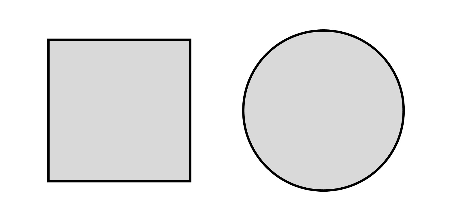
However, there are some cases that pop up from time to time where I feel many designers think that relying on numbers leads to an inferior result. For instance, matching the exact pixel heights and widths of two different shapes often makes an imbalance in the visual weight of the two.
Let’s specifically use a square and a circle as an example. If a circle is placed next to a square of the same height and width, the circle will look smaller than the square.
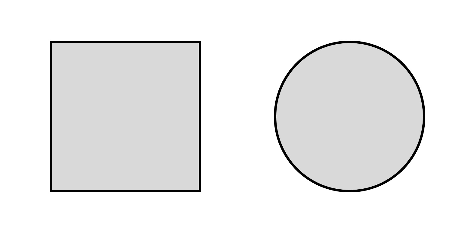
Many would think that this visual imbalance can only be adequately resolved by eyeballing. Sure, manually fiddling with the sizes of the two shapes until our designer senses start tingling in response to a perceived match in balance is one way to fix it. But it actually can be done with math, in this instance by following the formula: w × h = π × r², where w and h are the width and height of the square, and r is the radius of the circle.
The idea behind the math is fairly simple: we create visual balance not by matching the heights and widths, but the total areas of the shapes instead. This creates a much more harmonious relationship between the two shapes, because they look like they’re taking up an equal amount of space.
Let’s take a look at another very common example: the ever-popular play button, made up of a triangle positioned inside a circle. Centrally aligning the circle and the triangle’s fitted bounding box results in an obvious visual imbalance desperately in need of tweaking, which leads designers to resort to manually nudging the triangle inside the circle until it feels properly balanced.
But there’s actually a “better center” for aligning an equilateral triangle, and it’s called a centroid—the intersection of its three medians. Using it means we can very precisely come to a visually balanced alignment simply by following a geometric principle, and it’s easily replicable if the need for it arises elsewhere in the design process.
These are fairly simple examples of designer intuition having a math counterpart that gives precise results. As projects rise in complexity, so do the possibilities for implementing math for more precise and uniform design elements.
Numbers and calculations for precision
Probably the most obvious implementation of math in our design process is grid systems. When based on mathematical principles like the Golden Ratio or the rule of thirds, they establish proportions and alignments that make it much easier to achieve a harmonious layout.
Typography can also benefit from mathematical ratios for balanced typographic hierarchies. For instance, the Golden Ratio can be used for establishing font sizes in typographic layouts, as well as calculating line height for ease of readability.
When it comes to visuals, designers use calculations to maintain aspect ratios in images and create strong compositions. And, of course, vector graphics employ the mathematical concept of Bézier curves to create precise curves very often used in icons and logos.
As is clear, numbers and math provide the backbone of any well-designed interface. Spacing, proportions, font sizes—these are more often than not arbitrary choices. They are calculated, deliberate decisions made with much regard for usability and implementability. This is very important in modern responsive web design; since it demands consistency across various devices, it heavily relies on precise measurements and guidelines for a uniform user experience.
UI design is pretty specific in this regard in relation to adjacent fields like, say, graphic design. One could maybe argue that there is a tangible difference in reliance on math and numbers between the two. Graphic design, focusing on visual communication and standalone visuals, still strives for structure and therefore employs math for layout and proportion—but nevertheless allows more room for artistic choices.
This kind of artistic freedom is not something that’s common practice in UI design. UI design simply demands a more systematic and precise application of mathematical principles, especially concerning interactive and responsive interfaces. And a structured approach ensures consistency, usability, and effective collaboration with development teams.
Design systems
Obviously, design systems are there for a reason. We can’t really live in a world where every button on a single page is a different shape and every shade of blue is fair game, can we?
That’s why design systems have a clear role in modern UX practices. They make designs more uniform and consistent, and the end product just looks better. Think of Google’s Material Design, or Apple’s Human Interface Guidelines; principles, measurements, and reusable components establish the much-coveted consistency and coherence across products, and even create a familiarity among users who end up associating certain design choices with the brands that use them.
There’s another angle to it. This kind of structured framework with precise measurements enables a much smoother transition from design to development, as they allow developers to translate designs into code more easily. Not having one just leads to endless back-and-forth and wasted hours. Not to mention what a nightmare it would be not to have a design system for a big project spanning several products.
Finding the balance
Eyeballing has its place in the creative process, but relying solely on it is really not a substitute for proper UX design principles and techniques. While designer intuition serves as a fundamental starting point for creative ideation, and it’s certainly important for designers to hone their “eye”, there needs to be a balance between intuition and precision.
So, while it’s a good thing for a designer to be able to design by feel, this intuition of theirs simply can’t stand alone for anything at least a bit complex. It must be complemented by a deeper understanding of certain mathematical principles and, if it’s a team project, an adherence to an established design system, as the usage of mathematical principles and the adherence to design systems is exactly what elevates digital products today.