Liquid Glass Instead of Just Another Round of Minimalism
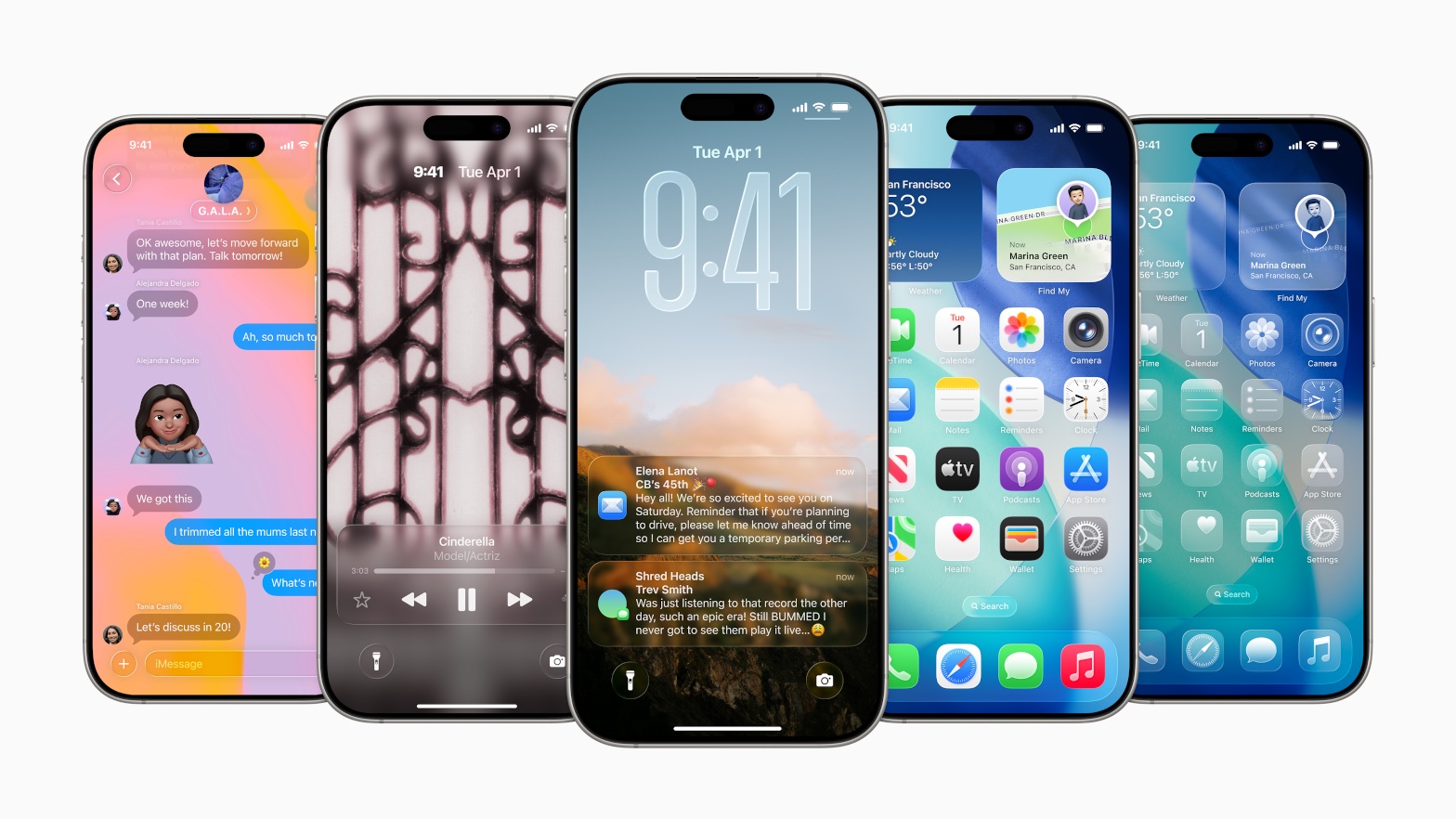
Clean and transparent, but at a cost
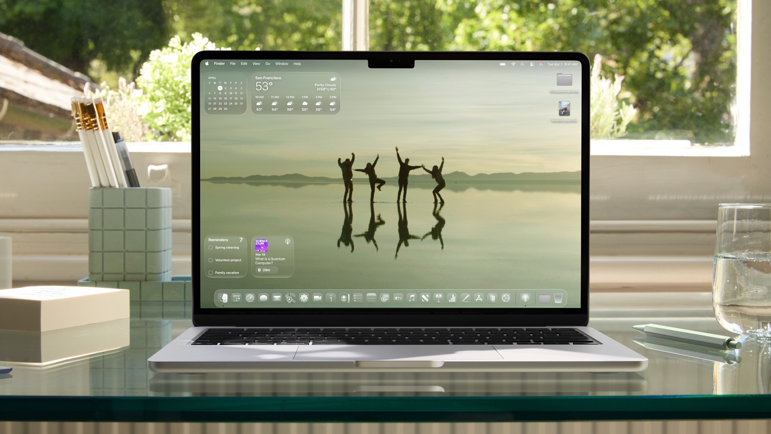
Alright, I’m sure everyone’s already seen the new design update for iOS 26, iPadOS 26, macOS Tahoe 26, watchOS 26, and tvOS 26. Apple’s new Liquid Glass design is currently the topic that everyone on the internet seems to have an opinion on. Naturally, what else would I do than share mine as well?
As is tradition, everyone’s complaining again. I think I’ve seen more people trying to be funny about it than actual reports or reviews. Still, none of the criticism surprises me. The main complaint I see thrown around is readability, which is completely fair. A glassy notification over a light background is not exactly the best idea.
The transparency, blur effects, low contrast, flowing animations… They all look great in a demo video, but in practice, it can be a bit hard on the eyes.
But, overall, I think this new design is… pretty good. Not perfect, but good. Don’t get me wrong; I’m not saying all those criticisms are unsubstantiated. There are obvious issues—yes, readability and distracting animations are a problem—but I actually appreciate that Apple is finally trying something creative again. 99% of apps and OS-es in the last few years felt like they were built from the same minimalist template. It’s refreshing to see someone try to shake things up.
A “new” direction, same old resistance
I guess what we’re seeing here is the familiar cycle: Apple drops a new visual direction or something, people complain, and a couple of months later everyone’s okay with it. I’d say it’s all much of the same as it happened with skeuomorphism, then with flat design and minimalism, and now with Liquid Glass.
I’ve seen some comparisons to Frutiger Aero and Windows Vista’s visuals as some kind of “gotcha” for Apple being uninventive with Liquid Glass. Sure, it’s not exactly never-seen-before, but it’s still disruptive to the current mainstream that’s mainly just a couple of flavors of minimalism.
I’ve seen plenty of nostalgia towards Frutiger Aero and Windows Vista in recent times, and I haven’t seen much criticism directed towards those this time around. Makes me wonder if the backlash is more about the source (Apple) than the substance. But still, why not let those kinds of visual identities have a comeback of sorts? This might be a step towards that.
Also, what we’re seeing now is not the final form. (In fact, they’ve already done some tweaks.) There will obviously be more iteration after user feedback, so the design is going to see some more polish before it gets released for good. Apparently, public beta is coming in July, so plenty of time for tweaks before the fall release.
Imitation is the best flattery… or something like that
I’m also curious how the rest of the design world will respond in practice. I’d bet that Figma is going to introduce a Liquid Glass-style effect at some point, especially since designers are already racing to recreate it there. And love it or hate it, this look is going to be everywhere soon.
This is probably the thing that concerns a lot of people, I think. The very likely course of events that we’ve seen over and over throughout the years: everyone’s going to start copying Apple’s design without second thought. Copying Apple is, of course, completely unimaginative, but can also be a problem if the original design isn’t as usable as it should be. So, that’s—generally speaking—a valid concern. A lot of designers obviously think that copying these big companies is a pretty safe choice, but that’s how we get a rather monotonous design landscape. This time around, it might also turn the landscape into an accessibility mess. Of course, this is all in the completely unlikely event that Apple releases their new design without further tweaks. When they polish it, they’ll still get copied, but at least it won’t bring about a general shift towards eroded accessibility in user interfaces.
Problems are always present when things are starting out. As I said, I’m sure that most of it is going to be ironed out until release. But at least they made a step outside of the box; even if it’s not completely new, it’s going against the mainstream. It’s a total shift from flat design and it feels fresh, no matter how controversial it is. Maybe the design space actually needs this to kick into gear a more creative approach towards design.