Systems of visual appeal: Understanding balance and symmetry in UX design

The beauty of (a)symmetry
As I was doomscrolling myself to death on various social media a while ago, I encountered something that I managed to miss throughout my whole random-bits-of-info-riddled life.
The thing I stumbled upon is the rule of odds, often used in photography and visual art in general, and it immediately made me wonder: how can it be used in the context of UX design?
If you also haven’t heard of it before, the rule of odds is based on the idea that having an odd number of subjects or elements in an image makes it more interesting to us. Apparently, this is because our brains like to group objects in pairs—but if there’s an odd number of objects, they’re not as easily organized, and one of them might appear dominant instead. This kind of composition is said to make viewers look at it for longer than they would look at an even-numbered depiction.
So, can it be used in UX design? Long story short, it depends. Thanks for reading.
But in all seriousness, the rule of odds in UX really got me thinking about… well, I guess we could refer to them as “systems of visual appeal”.
What makes viewing experiences pleasant or appealing? For instance, we like ourselves some symmetry and order from time to time, don’t we? So, we humans are inclined towards certain elements and patterns, with symmetry being a prominent example. Sure, odd compositions work well for pieces of art, but in something that is supposed to be practical—like a user interface—a lack of balance can feel chaotic and disorienting to a user.
But, is symmetry always desirable in UX design? Is symmetry even all that cool? Seems like I have no choice but do what I always tend to do: overanalyze this topic by going into a philosophical deep dive. My kind of fun.
Symmetry and asymmetry, balance and disbalance
What are we exactly working with here? What governs the systems of visual appeal—or rather, why do we have these tendencies that we replicate in visual arts and works?
For instance, our inclination towards order and symmetry is quite pronounced. Now, there have been many studies and even more unscientific guesses as to why this is so, and I’m far from an expert on the topic. But as far as I can gather, our attraction to symmetry has a simple explanation: one part of it is that it’s familiar to us. We see it everywhere; our bodies are symmetrical, our faces, as well as a whole lot of things in nature. Animals, flowers, leaves, crystals, snowflakes, you name it.
The other part seems to be rooted in our biology. Our brains recognize symmetrical objects and images more easily than asymmetrical ones, and the brain doesn’t “like” when things appear accidental. It constantly tries to recognize order, and symmetry is just one of a number of shortcuts that help it quickly make sense of the world it’s seeing.
But then, since human brains appear to be a tough crowd, too much symmetry can also be boring. Oftentimes, people will find slightly asymmetrical faces and objects quite appealing or intriguing; we also seem to spend more time focusing on them.
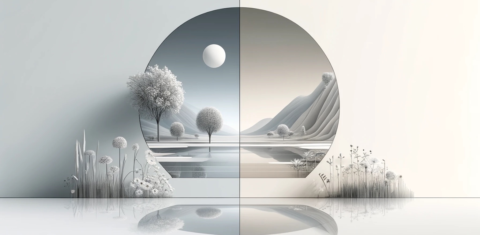
Because perfect symmetry can feel artificial, it could be argued that what we’re actually seeking is visual balance instead. We can see this tendency for slight “imperfection” in art; when the artist happens to create the right kind of balance between order and chaos instead of chasing technical precision and symmetry, the result can seem dynamic and lifelike, and we tend to find it appealing or even moving.
Systems of visual appeal tap into all this. The rule of odds, as an example, “breaks” the symmetry shortcut that the brain relies on when quickly computing the object of its focus. And while a group of odd-numbered objects can still feel orderly and symmetrical, which is supposedly satisfying to the brain, simply not being able to be grouped in pairs creates enough mental interest that intrigues and therefore makes us want to look at the composition longer. It’s just the right balance of chaos and order for our neurons.

Intuition and feeling revealing underlying principles
So, we obviously have some innate inclinations towards certain depictions of orderliness, and both pandering to and subverting these inclinations gives us results that we can work with.
Various factors contribute to making a design visually “orderly” and, therefore, appealing, or “properly” disbalanced and interesting; many of them have a mathematical basis (the Golden Ratio, for example), while we still rely on intuition or feeling for others. (I’d argue that these others might have mathematical bases as well, we just haven’t discovered them yet.)
To draw a parallel with music, for instance; there are rules and patterns in music that have, over time, evolved into traditions with detailed theories in various cultures across the world. While a skilled musician can rely on intuition and feeling to create works that fall into specific traditions or genres, formal knowledge of music theory can help in many ways and lead to deeper understanding, as well as simplifying the exchange of ideas among practitioners who are similarly versed in theoretical knowledge.
Just as these patterns exist in music, there are some (and there might be many more) similar principles underlying design. Designers have initially relied on intuition and feeling, but gradually discovered underlying principles and patterns through practice, observation, and research. That’s how we’ve ended up with certain design rules, as well as with fully-developed design systems that make use of established design patterns.
Facilitating usability vs. drawing attention in UX
Now, since I’ve mentioned the context of art, there’s something to be said about UX design being an art in itself; however, I’d rather consider some aspects of it as applied arts in the service of function, which still comes first and foremost in UX. This certainly puts some constraints into place when it comes to applying certain rules here.
When considering strictly visuals, we can definitely treat them more like art and photography, to an extent; an asymmetrical composition with an odd number of elements will most often than not appear more dynamic and interesting. This can maybe benefit certain aspects like product or hero pages that often rely heavily on illustrations and pictures.
But when it comes to interface elements and content grouping, this is where things get tricky. Since people generally don’t approach apps and websites as they would a piece of art—they’re more likely to be there to do or find something instead of simply gawk at stunning visuals—it seems like it would make sense to make ample use of symmetry and balance. If we consider what’s been told about human brains and symmetry, we can argue that symmetry in design helps with recognizing patterns. That way, we can facilitate usability and supposedly help users understand and navigate the actual content.
At least when it comes to elements like buttons and input fields, exactitude is indeed important. You’ll rarely (if ever) see a sign-up or log-in screen with small irregularities in its design. Many people will notice if a button is two pixels to the left, if the text inside the button is not centered, or if one input field is slightly wider than the other—and not in a good way.

Controlled disbalance
Does that mean we should be applying symmetry to just about every element of a design? Well, of course not. We still use disbalance and asymmetry in interface layouts. Asymmetrically balanced elements can draw the user’s attention to specific areas within a design, right where we want it. This kind of “controlled disbalance” is great for guiding users toward key content or actions, like a CTA button.
Naturally, we can make elements that catch a user’s eye by a number of different means, including size, colors, contrast, as well as having odd numbers of elements to create a natural focal point on a page or in an interface. Designers in marketing probably use these kinds of elements very often, even if not systematically, but rather intuitively.
Cracking the code
And that’s a specific point that’s asserting itself here. Even if we have some design rules and established design systems, we still rely mainly on intuition to create these effects. However, as I mentioned, I believe that there are many more rules than we currently know of which have an underlying mathematical basis or other kind of logic to them.
To use music as an example again: our understanding of various principles governing music has continuously evolved to become more exhaustive and more intricate as time went by. And by “time”, I mean centuries, across a range of different cultures.
In contrast, UX design is very, very young as a field, and has been around for just a fraction of that time. It certainly hasn’t had enough time to have us establish a theory of a similar scope as that of traditional arts. So, I’m curious about the level of formalization that UX design might reach one day regarding these systems of visual appeal; it would be interesting to see a kind of systematization that would establish concrete guidelines and rules. And there’s a way to expedite this process.
I expect that artificial intelligence will probably play a role in recognizing patterns and underlying principles that we humans still haven’t fully grasped yet, since this is something it does pretty well. And I take it we have 50 years at best until AI destroys us completely, anyway—it would be nice if it cracks the code for visual appeal, just so we designers can have a bit more fun before our complete annihilation 😉.


