AI design style: the emergence of a new aesthetic
Text-to-image AI models imagining UI
The future is here. Design is slowly turning towards artificial intelligence. AI design tools will be taking our jobs. Are you rustled yet?
One year ago, it would’ve been unimaginable to a wider audience that images could be generated from a text prompt. Today, these text-to-image models are producing all kinds of artful imagery. It was only a matter of time when UX/UI designers would start attempting to use them in their creative process.
Fear not: our jobs are safe for now. Currently, the outputs are just static mockups of random user interface pages and, at present, not useful for practical application. Despite this, it seems that some of them do end up successfully conveying a broad concept with a distinctive look. So what’s the deal?
Attempts at a workable result
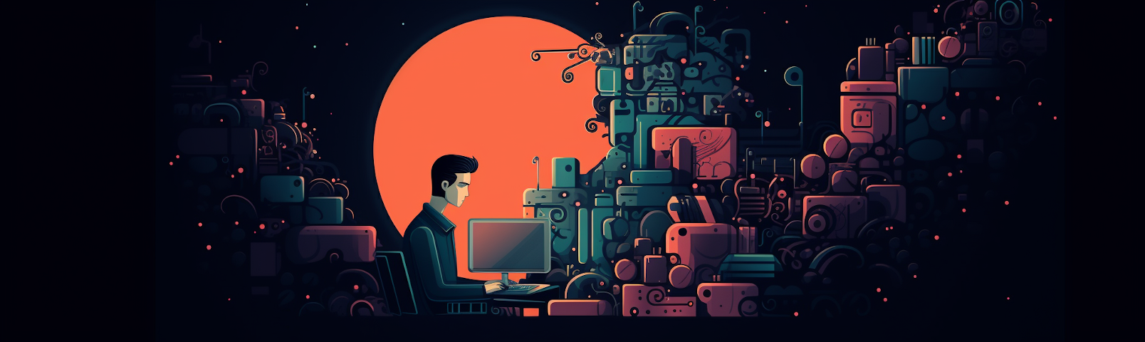
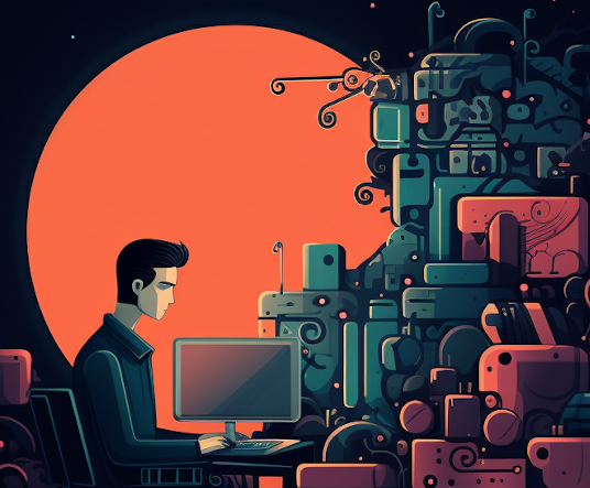
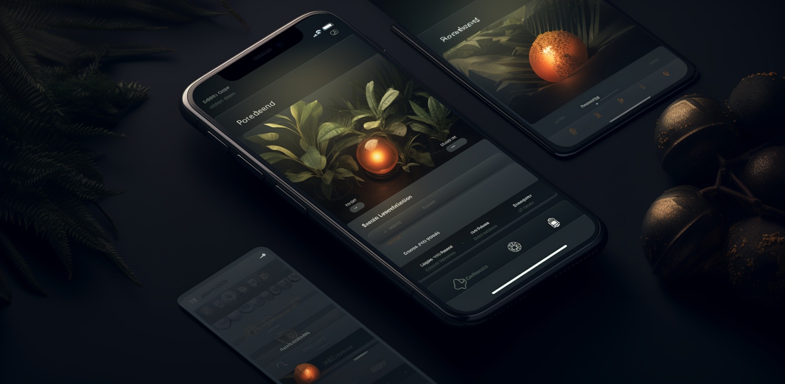
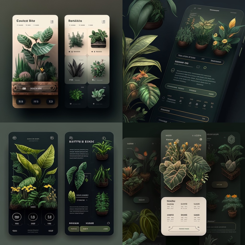
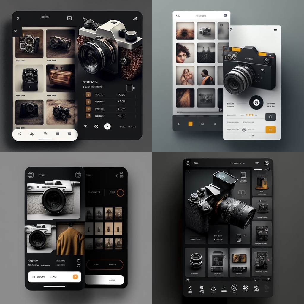
After coming across a number of examples of others posting Midjourney’s attempts at generating user interfaces, I decided to give it a try to see what would happen. Unsurprisingly, I found the process to be quite bothersome; it took a lot of effort, and the results were, naturally, never anything viable. Midjourney often insisted on making everything look three-dimensional, even when such an instruction wasn’t present in the prompts. It’s almost as if it was never meant for this kind of thing, right?
A couple of headaches later, I was able to generate a few… interesting results. Curiously though, the generated UIs sported what almost looked like a unique style, specifically due to the use of elevation and illumination—but more on that later.
Distinctions and familiarities
Let’s state the obvious. These AI-generated mockups would evidently need a great deal of refinement from an actual human designer in order to be even remotely usable, though they are a potentially useful tool for ideation, visual exploration, and moodboarding in the early phases of the design process. Other than that, they are merely interesting to look at.
Putting all the shortcomings aside, using the right prompts tends to result in a layout with a decent visual hierarchy of elements. As one would(n’t) expect, the imagery, icons and illustrations are highly detailed and precise, barring some visual “glitches”, often with a distinctive skeuomorph-esque form. Still, the dimensionality and elevation make for an interesting pop-out effect. All in all, the visual elements have a unique and somewhat curiously satisfying appeal, despite the glitchy quirks. Almost like there’s a tangible, tactile quality to them, thanks to their 3D nature.
Some of these aspects of the AI-generated designs are to a certain extent comparable to (but, of course, still different from) those of the so far unsuccessfully adopted neuomorphism, which could be classified as minimalism, but with extensive use of shadows and elevation that give a subtle 3-dimensional feel to the usual UI flatness. In this regard, neuomorphism can be described as a hybrid approach that incorporates certain elements of skeuomorphism, and these AI designs seem to vaguely be on a similar track as well.
Considering the presence of illumination that interplays with the dimensionality and elevation of the detailed imagery, the designs give off a sense of depth combined with deliberate lighting that kind of remind me of a theatrical set or a film scene. The sense of presence of a fixed camera also brings to mind the process of creating a user interface in Unity, where one can set the canvas to be rendered by a specific camera in the scene; camera-specific settings can then be applied to the UI, like the use of a perspective camera to give the UI a feeling of depth.
Imagining a trend
Now here’s a thought: could we imagine this style becoming fashionable? It’s always hard to envision future possibilities, but, issues that would need to be polished out aside, let’s say that I can sort of picture some potential for a trend. Could it have a name, though?
Let’s see. It looks like it pops out. Floats, even. It looks dimensional, illuminated, staged. Like a scene.
Floatism? Depthism? Illuminism… um… Scenomorphism? Sure, let’s go with that.
Anyway.
While I can easily see it going nowhere, who knows; something might happen in its wake sometime in the future if this current rough and untamed state ever gets honed and refined, with its core aspects established within a functional paradigm or system suitable for practical application.
Complexity of implementation wouldn’t need to be a hurdle. Now that large language models have emerged and shown an inkling of considerable future capability when it comes to programming, implementing styles like these could soon be much less of a difficulty. With the use of AI, designers could theoretically have more precise control than humans in managing factors such as light direction—similar to how it’s currently often done with CSS generators when it comes to neuomorphic shadows, for example.
Minding the balance
Playing with text-to-image models like this, even if it’s not their intended usage, is certainly entertaining; as is imagining hypothetical future possibilities such as emerging design styles.
However, were a new design style ever even to (d)evolve from this in any way, it stands to reason that it would be essential to ensure that it’s implemented appropriately, with a keen eye towards continuing the placement of content at the forefront of the user experience.
So, while this AI-generated “style” may be at times and under certain conditions visually appealing, it’s still important to remember that the ultimate goal of UI design is to provide a seamless and efficient user experience. The challenge is to strike a balance between incorporating visual elements that enhance the experience without becoming too obtrusive. After all, the right balance between simplicity and embellishment is what makes a great design compelling.